On may 31st 2017 D2i – Design to innovate co-hosted Danish Design Award. An award celebrating the difference design can make.
The award took place in an old shipping warehouse at the harbour in Kolding and the rough surroundings of the harbour, industrial materials from local companies combined with design thinking became the core of the concept for the venue design. Through the spatial experience we wanted to push peoples perception of design and the difference design can make when used in different contexts. In that way we designed a venue that supported Danish Design Awards core story.
By using large cardboard plates, shrink wrap, concrete blocks, cardboard tubes, to mention a few, we created a unique venue where the 600 guests got an unexpected experience in raw and elegant surroundings.
Info: Created in collaboration with D2i – Design to innovate www.d2i.dk and Culture Works www.cultureworks.dk
Disciplines: Art Direction, concept development, graphic design, spatial design, branding, project management
Photos: Montgomery Photography www.montgomery.dk
CPH City & Port Development wanted to develop an exhibition in the old DLG-silo in the Nordhavn district of Copenhagen.
The main focus of the exhibition is Nordhavn, the history, the current and future development, however CPH City & Port Developments general work with city development had to be featured as well.
The purpose of the exhibition space was to create a dynamic platform with multiple possibilities that gives the visitor an informative yet visual engaging experience.
By the use of light, birch veneer, hand drawn illustration and simple graphics we created a poetic exhibition space as a beautiful contrast to the raw surroundings of the silo.
The design of the interior and graphics are based on an intelligent grid system that allows the content to change and relocate.
Info: Created in collaboration with Mike Ameko Lippert (https://www.behance.net/mlippert), Heidi Cathrine Østergaard, Linda Korndal and Kollision (www.kollision.dk)
Disciplines: Art Direction, concept development, graphic design
Photos: Irina Boersma
In 2016 an old warehouse at the harbour in Kolding was turned into Pakhuset, a vibrant working community for entrepreneurs, educational institutions and a number of small- and medium sized companies in Kolding.
I was asked to develop the visual identity for this new space. The core of the visual identity is to show the warehouse as a flexible frame, where different companies and people help create identity for the space.
Info: Created in collaboration with D2i – Design to innovate www.d2i.dk
Disciplines: Art Direction, concept development, visual identity, signage, graphic design
Following the EXPO Shanghai we created a book showing the Danish exhibition and pavilion. The book is a visual tour through the pavilion and contains various images from both in- and outside the pavilion.
Info: Created for and in collaboration with 2+1 Ideas agency
Disciplines: Graphic design, editorial design
RENOVER is a campaign developed for GI (The Landowners' Investment Association) and Realdania. The purpose of this campaign was to change the general attitude towards renovation among architects, craftsmen and developers.
The campaign includes marketing and PR, various printed matter and a campaign summit.
To reflect the process of renovation we developed an identity that was raw and unfinished however with some elegant features. Furthermore we made the identity come alive through the scenography created for the RENOVER summit.
Info: Created for and in collaboration with 2+1 Ideas agency
Disciplines: Art Direction, strategic design, concept development, spatial design, graphic design, project management
Photos: Hanne Hvattum
Shortlisted for Creative Circle Award
As Copenhagen Citizen Service (Borgerservice) changed their service strategy and left only one service center open to the public, they placed small 'help-stations' (Borgerservice Kvik) in a few selected Copenhagen libraries. With this change they needed to update their identity from 2007.
The new service strategy's main purpose was to encourage citizens to handle most private businesses on the internet. However some issues, like issuance of a passport or drivers license, must be handled in Borgerservice.
With this knowledge we decided to create a signage system with a strong identity that not only guided citizens in and out of Borgerservice fast, but also became the new identity. The signs were placed in one service center and selected Copenhagen libraries.
Info: Created for and in collaboration with 2+1 Ideas agency
Photos: Hanne Hvattum
Copenhagen Main Library
Copenhagen Main Library needed clearer signage and navigation in their main lobby. We created a clear 'Reception' sign and numbers from cut out wood to match the new reception desks.
Info: Created for and in collaboration with 2+1 Ideas agency
Disciplines: Art Direction, strategic design, concept development industrial/spatial design, graphic design, project management
Photos: Hanne Hvattum
During COP15 in Copenhagen The City of Copenhagen and CPH City & Port Development wanted to arrange a joint exhibition about the city district Nordhavn. We helped curate and design this exhibition which showed the future development of Nordhavn in an abstract way.
Info: Created for and in collaboration with 2+1 Ideas agency
Disciplines: Art Direction, concept development, spatial design, graphic design, project management
Photos: Pernille Ringsing
This exhibition was created for Kattegatcentret in Grenaa, Denmark. It is a permanent exhibition with 10 interactive installations, all designed to create exciting and learning based experiences in order to extend the visitors' knowledge of the ocean.
Info: Created for and in collaboration with Oddfischlein and Redia
Disciplines: Art Direction, graphic design, project management
The peoples park in Copenhagen, Fælledparken, is undertaking comprehensive development and renewal. As part of this renewal Copenhagen Municipal asked for a wayfinding and inspirational signage system for the park. It was important that the design had a strong visual identity which would help define the parks identity.
Fælledparken is and has always been for the people of Copenhagen. Its a traditional park however its users and activities are very diverse. To reflect this we created a simple yet modern signage system where colours bring diversity, pictograms inspired by people on a sunday stroll bring tradition and super icons serve as activity inspiration or meeting points.
Info: Created for and in collaboration with 2+1 Ideas agency
Disciplines: Art Direction, strategic design, concept development, wayfinding, graphic design, project management
Info: Created for and in collaboration with 2+1 Ideas agency
Disciplines: Art direction, identity, map and icon designindustrial/spatial design, graphic design, project management
Info: Created for and in collaboration with 2+1 Ideas agency
Disciplines: Art Direction, graphic design, project management
Verdens Bedste Nyheder (The Worlds Best News) is an information campaign formed by the UN, Danida and more than 80 Danish aid organisations.
2+1 was asked to develop an identity for the campaign as well as designs for a large variety of campaign elements.
Info: Created for and in collaboration with 2+1 Ideas agency
Disciplines: Graphic design, project management
http://verdensbedstenyheder.dk/
Martin Summers Fine Art commissioned One80 Design to create a book for an Andy Warhol exhibition where a private Warhol collector sold his collection of paintings from The Athlete Series.
In true Warhol style the cover of the book was silk screen print on a strong red canvas.
Info: Created for and in collaboration with One80 Design
Disciplines: Art Direction, graphic design, project management
In 2014, The Food Stall opened their first organic convenience store at Odense Railway Station. For two years, they have spoiled their customers with delicious organic sandwiches and freshly squeezed juices. In 2016, after two years of success in Odense, they decided to open their second store at Vejle Railway Station.
For their new store, The Food Stall wanted a more thorough and consistent design. We helped developed a design strategy for this and future stores. Based on this strategy and inspiration for the store in Odense, we created a space that exudes quality, coziness and ecology.
Info: Created in collaboration with Christel Maria Jantzen
Disciplines: Art Direction, concept development, graphic design, spatial design, branding, strategy, visual identity, project management
Photos: Simon Meyer
Info: Developed for and in collaboration with Stupid Studio
Disciplines: Art Direction, concept development, graphic design, project management
DANISH™ Exhibition
Disciplines: Art Direction, concept development, graphic design, exhibition design, spatial design, project management
Remove The Background is the leading product image editing service for internet retailers, bloggers, designers, photographers and webmasters. They are founded in 2011 in Denmark. In just a few years they have expanded rapidly and are now a large international company.
They approached me with a wish to change their visual identity. In close collaboration we developed a new and updated visual expression including colours, fonts, infographics, corporate photos and logotype.
Info: Developed for Remove The Background (now Pixelz)
Disciplines: Art Direction, strategic design, concept development, branding, graphic design
Info: Created for and in collaboration with Made by Makers
Disciplines: Art Direction, graphic design
In november 2017 the Finnish goldsmith Mari Keto transformes the ruin hall at Koldinghus into a coherent installation where she invites the visitor into a sparkling, magical landscape. Beauty beguiles the eye, but on closer inspection, the unpleasant truth about humankind’s overexploitation of nature is revealed. Angels drop dead. A mini-city pours out of the belly of a stuffed moose, and between the colourful wings in the butterfly collection silver-cast human bodies are frozen in a silent scream.
For this exhibition Koldinghus needed a concept and design for the signage within the exhibition as well as the catalogue.
The overall expression of the exhibtion was captured in the catalogue by using the colours from the installations in the catalogue and also by using a silver hot foil on the cover as a reference to the silver used in a lot of the art pieces. The signage is simple and elegant black print on birch veneer
Disciplines: Art Direction, concept development, graphic design, layout, editorial, signage design, project management
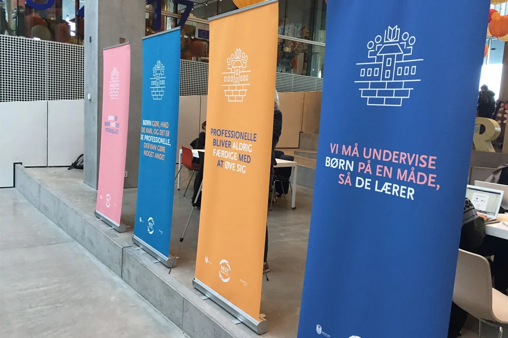
NEST Aarhus is a program in which children with Autism Spectrum Disorder and similar difficulties are included in ordinary primary school education. A very exciting and important project.
I was asked by CFIA (Center For Innovation Aarhus) and the Municipality of Aarhus to help develop a strong visual identity for the NEST Aarhus program including a redesign of the NEST model and elements for a conference.


![_L4Q5047[1].jpg](https://images.squarespace-cdn.com/content/v1/54f829a2e4b0dd679d6ba9f4/1426502320370-XOTYJE8R3EUPT3ZB1LLI/_L4Q5047%5B1%5D.jpg)